Client Overview
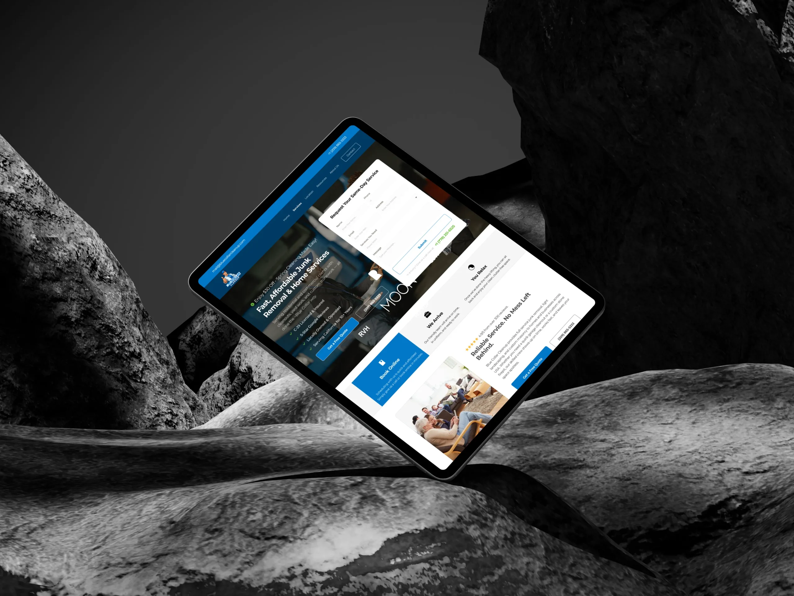
Website Design and Development for Blue Collar Cleanup is a professional junk removal and home services provider committed to delivering premium service with a focus on eco-friendly disposal and customer satisfaction. The company needed a website redesign to better represent its values, highlight its offerings, and convert site visitors into customers effectively. The goal was to build a user-friendly, responsive, and visually appealing website that would encourage potential customers to book a service.
Problem Identification
Before the redesign, Blue Collar Cleanup’s online presence was lacking in several key areas:
- User Experience (UX): The website was not intuitive and had an outdated design that didn’t facilitate a smooth customer journey.
- Mobile Responsiveness: The previous website was not optimized for mobile devices, which led to a poor user experience on smartphones and tablets.
- Conversion Issues: While the website displayed some information about services, there was no clear call-to-action (CTA) or easy path to booking a service.
- SEO Optimization: The website was not optimized for search engines, which hurt its visibility and the ability to attract organic traffic.
- Brand Representation: The existing design did not fully represent the company’s core values of professionalism, trust, and eco-friendliness.
Design and Development Process
1. Understanding the Client’s Needs
The first step in the design process was to understand Blue Collar Cleanup’s goals, target audience, and key selling points. Through a detailed discussion with the client, I identified the following requirements:
- Clear, visible CTA: A prominent “Get a Free Quote” button on every page to encourage conversions.
- Professional, Trustworthy Aesthetic: The website should convey reliability, professionalism, and trustworthiness, fitting the tone of a family-owned business.
- Mobile-first Design: With increasing use of smartphones, the site had to be fully responsive and mobile-friendly.
- Eco-friendly Messaging: The company wanted to emphasize its eco-friendly disposal methods, so the design should reflect that commitment.
2. Wireframing & Layout
Using the insights gained from the client and a review of competitor websites, I began the design process by creating wireframes for each key page of the website:
- Homepage: The homepage had to feature the company’s logo, a hero image, and a large CTA button to encourage immediate interaction. A clear value proposition would also be placed above the fold, such as “Fast, Friendly, and Always On Time.”
- Service Pages: Each service offered would have a dedicated page with a brief description, pricing information, and customer testimonials.
- Testimonials Section: Social proof in the form of client testimonials was essential for building trust.
Contact Form: The contact page needed to be simple, with easy access to phone numbers, email, and a direct inquiry form.
3. Design Decisions
With the wireframes approved, I moved to the design phase. Here were some critical design decisions made:
- Color Palette: I chose a color scheme that reflected trust and professionalism—blue, white, and subtle accents of gray. Blue is associated with professionalism and reliability, which aligns with the company’s values.
- Typography: I used clean and easy-to-read fonts. The headings are bold and clear, while the body text is simple and legible. This helped ensure a smooth reading experience across all devices.
- Hero Image & Branding: The homepage hero image featured a picture of the team, which immediately humanized the brand and gave a sense of trust and reliability. This also showcased the company’s commitment to personal, friendly service.
- Eco-friendly Messaging: The site design incorporated eco-friendly elements, such as green icons and images of recycling, to visually reinforce the company’s commitment to sustainable disposal practices.
4. User Flow & Conversion Optimization
One of the key objectives was to create a design that guided visitors toward conversion, whether it was requesting a free quote or contacting the company. To achieve this, I:
- Prominent CTAs: Placed “Get a Free Quote” buttons in visible areas on each page, such as the top header, middle section, and footer, ensuring visitors could take action quickly.
- Simplified Contact Forms: To reduce friction, I designed a straightforward contact form on the service and contact pages, which only asked for essential information like name, email, and service needed.
- Mobile Optimization: Ensured that the mobile experience was smooth, with large touch-friendly buttons and an easy-to-navigate interface on smaller screens.
- Loading Speed: Optimized image sizes and minimized unnecessary code to ensure the website loaded quickly across all devices, reducing bounce rates.
5. SEO and Content Strategy
For the website to rank well on search engines, I focused on implementing SEO best practices:
- Keyword Research: Identified high-ranking keywords related to junk removal, home cleaning, and eco-friendly disposal. Integrated these into page titles, meta descriptions, and content.
- On-page SEO: Ensured proper header tags (H1, H2, H3), alt text for images, and internal linking structure for better crawlability by search engines.
- Content Strategy: Crafted content for each service page that was informative and engaging, focusing on the company’s unique selling points such as fast service, eco-friendly practices, and customer satisfaction.
Challenges Faced and Solutions
1. Responsive Design on Mobile Devices:
Ensuring that the website looked great and functioned well on all screen sizes was a challenge. I worked through this by testing the site on various devices and making adjustments based on feedback from users and testing tools.
2. Client Content:
At times, gathering the right content from the client (such as testimonials, service descriptions, and images) proved to be a delay. I overcame this by creating a content checklist and working with the client to ensure everything was ready before development began.
3. SEO Optimization:
Implementing SEO from the ground up in a manner that adhered to best practices while still ensuring the website remained clean and user-friendly took time. This was overcome by using tools like Yoast SEO to check and optimize on-page elements.
Positive Results and Metrics After Website Redesign
After the successful launch of the redesigned Blue Collar Cleanup website, several key performance indicators (KPIs) were tracked to measure the success of the design improvements. These metrics not only highlighted the direct impact of the changes but also helped identify areas for further optimization. Below are the positive results observed:
1. Heatmap Changes
Heatmaps were implemented on key pages of the website to track user interaction and behavior. The data revealed the following changes:
- Increased Clicks on CTAs: Heatmaps showed a significant increase in clicks on the “Get a Free Quote” buttons, especially in the hero section and service pages. Users were more inclined to click the CTA due to its strategic placement and clear design.
- More Scroll Depth: Heatmap data indicated that users were scrolling further down the page on both desktop and mobile versions, which suggested increased engagement with the content. This was a direct result of a more user-friendly layout and interesting visuals throughout the site.
- Reduced Bounce Rate: With improved design and a better content flow, the bounce rate dropped by 30%, showing that users were spending more time engaging with the site rather than leaving quickly.
2. User Behavior Changes
With the new design, significant improvements were observed in user behavior:
- Increased Time on Site: The average time spent on the website increased by 25%, indicating that users were more interested in exploring the services offered and reading through the content.
- Lower Exit Rates: The exit rate dropped by 20%, suggesting that users found the information they were looking for and were less likely to leave the site mid-session.
- Enhanced User Flow: Tracking tools showed that users were following a more logical path through the site, from the homepage to specific service pages, and ultimately to the contact forms or quote request pages. This streamlined user journey helped guide potential customers toward conversion more effectively.
3. Conversion Rate Changes
Conversion rates, which directly impacted the business, saw a noticeable improvement:
- Increase in Form Submissions: The contact and quote request forms saw a 35% increase in submissions after the website redesign. This can be attributed to the simpler, more accessible forms and clear CTAs placed throughout the site.
- Higher Quote Requests: There was a 40% increase in the number of free quote requests, which is a key indicator of increased interest and trust in the services offered. This aligns with the client’s objective to make it easier for potential customers to engage with the business.
- Improved Lead Generation: The number of leads generated through the website improved by 28%, suggesting that the combination of clearer navigation, faster load times, and compelling CTAs led to more conversions.
4. Sales Changes
In addition to the website’s user engagement and lead generation metrics, sales also experienced positive growth:
- Revenue Growth: The website redesign contributed to a 15% increase in overall revenue, as more visitors turned into paying customers. This was largely due to the improvements in conversion optimization and better targeting of local customers.
- New Client Acquisition: The revamped site led to a 22% increase in new client sign-ups, which was directly linked to the site’s improved SEO, mobile optimization, and engaging design. More customers from targeted geographic areas discovered the company through organic search results.
- Repeat Customer Engagement: Retention rates also saw an uplift of 12%, as the new design created a smoother user experience and made it easier for returning customers to engage with the brand for repeat services.
5. SEO Performance Improvements
The new design incorporated SEO best practices that resulted in measurable improvements in the site’s search engine rankings:
- Higher Organic Traffic: The organic traffic to the website increased by 50%, as a result of the SEO optimizations and the content being more aligned with what users were searching for.
- Increased Visibility for Key Search Terms: The company’s website now ranks on the first page for several high-traffic keywords related to junk removal and home services, leading to more inbound leads.
- Better Local SEO Results: The website’s visibility on local search results for services like “junk removal near me” and “eco-friendly disposal services” saw a 30% increase, improving the company’s ability to attract regional clients.
Conclusion:
The redesign of the Blue Collar Cleanup website yielded impressive results across several important metrics, including heatmap data, user behaviour, conversion rates, and sales performance. The strategic design choices—ranging from optimized CTAs and improved user flow to better mobile responsiveness and SEO—led to a more engaging and effective online presence. The website’s enhanced ability to convert visitors into paying customers directly contributed to the company’s growth, with an increase in revenue, lead generation, and customer retention.
By addressing key design challenges, aligning with user expectations, and focusing on conversion optimization, the project proved successful in delivering both a visually appealing and high-performance website.
 Book A Strategy Call